Two coasts sit on the studio table this month: Sagres at the southwest corner of Portugal, and San Sebastián on Spain's northern shoulder. One faces the Atlantic across an open horizon at 37.0058° N, -8.9478° E, terminating in cliffs above Tonel. The other sits at 43.3267° N, -1.9729° E, where the Zurriola beach threads between two hills inside a working city. Both are drawn from the same OpenStreetMap coastline layer, at the same scale, in the same ink. The choice between them is not about which coast is better. It is about which coastline shape belongs on your wall. We will ask three questions to route you.
Question 1: Do You Want a Coast That Faces the Open Ocean or a Coast That Cups a City?
This is the first fork because it decides everything about what the print does on a wall. A coast that faces open water reads as horizon. A coast that curls inward reads as enclosure. Both are honest to their geography, but they carry different weights in a room.
Sagres sits at the extreme southwest of continental Europe. On a coastline map centred on 37.0058° N, -8.9478° E, the land ends and the Atlantic begins with almost no negotiation. The shoreline runs mostly north-south along cliff edges, with Tonel notched into the western face. There are no bays that swallow the eye. The print, drawn faithfully, is largely ocean — a wide field of paper broken by a hard edge of land.
San Sebastián is the opposite geometry. At 43.3267° N, -1.9729° E, the coast has been folded inward by the Bay of Biscay and then folded again by the hills of Urgull, Igueldo, and Ulía. The Zurriola beach is a short stretch of sand held between two rises. La Concha, immediately west, is a near-perfect crescent. Drawn to the same scale as Sagres, the San Sebastián print is dense with coastline detail — every metre of shoreline turns.
If You Want the Open Ocean: Choose Sagres
Choose Sagres if you want a print that behaves like a window. The strength of the composition is the emptiness of the Atlantic west of the cliffs, and the certainty of the land ending where it ends. On the studio's Sagres plate, the OpenStreetMap coastline data resolves into a single decisive line for long stretches — cliffs above deep water do not have the small inlets a beach coast does. The result is quieter and more meditative. It rewards a room where the wall itself has room to breathe.
If You Want a Coast That Cups a City: Choose San Sebastián
Choose San Sebastián if you want a print that behaves like a map — something the eye can trace. The Bay of La Concha, the mouth of the Urumea river that separates Zurriola from the old town, the two headlands, the small port under Urgull: all of these are visible at the same scale that resolves Sagres into a straight cliff. San Sebastián rewards close looking. A guest can stand in front of it and find the shape of a beach they walked on. Sagres does not offer that; it offers weather.
Question 2: Are You Drawn to a Headland or to an Urban Beach?
The second fork is about what surf culture means to you as a subject. Not the waves themselves — we do not draw waves; we draw the coast that shapes them — but the human context that surrounds the break. A headland break and an urban beach break live inside very different stories.
Tonel is the wave Sagres is known for, and it exists because of the cliff geometry above it. The spot sits below the promontory that carries the Cabo de São Vicente lighthouse a few kilometres west, and the coastline here has been described by mariners since Prince Henry the Navigator kept his school of navigation nearby in the fifteenth century. The cultural weight of the place is old, maritime, and largely uninhabited. You do not visit Tonel on the way to somewhere else. You go to the end of a road.
Zurriola is the opposite. It is the surf beach of a city of 190,000 people, on the east side of the Urumea, in the Gros neighbourhood that was substantially rebuilt after a breakwater tamed the mouth of the river in the 1990s. The break is walkable from restaurants, from a food market, from the funicular that climbs Monte Igueldo. Surf culture here is stitched into an urban fabric that also includes the annual Zinemaldia film festival, a Michelin-star density that is among the highest in Europe, and the Basque language on every street sign.
If You Are Drawn to a Headland: Choose Sagres
The Sagres print reads as edge-of-the-world. It is a study of a place where the land runs out. If your affinity for surf coasts is really an affinity for cliffs, lighthouses, weather that arrives from a thousand kilometres of open sea, and the small courage of the towns that hold on at the last cape, Sagres is your coast. The print carries that inheritance in its shape without needing to state it. There is nothing decorative in a Sagres line drawing — the drama is entirely in the geography.
If You Are Drawn to an Urban Beach: Choose San Sebastián
The San Sebastián print reads as a place where people live. Zurriola is not the whole subject — La Concha, the port, the river, the old town all sit inside the frame — but Zurriola is the modern surf anchor. If your relationship with a coast includes walking to it from a bakery, hearing a language you do not entirely follow, and watching surfers cross a boulevard in wetsuits, San Sebastián is your coast. The print gives you a city that happens to face the sea, drawn with the sea taken seriously.
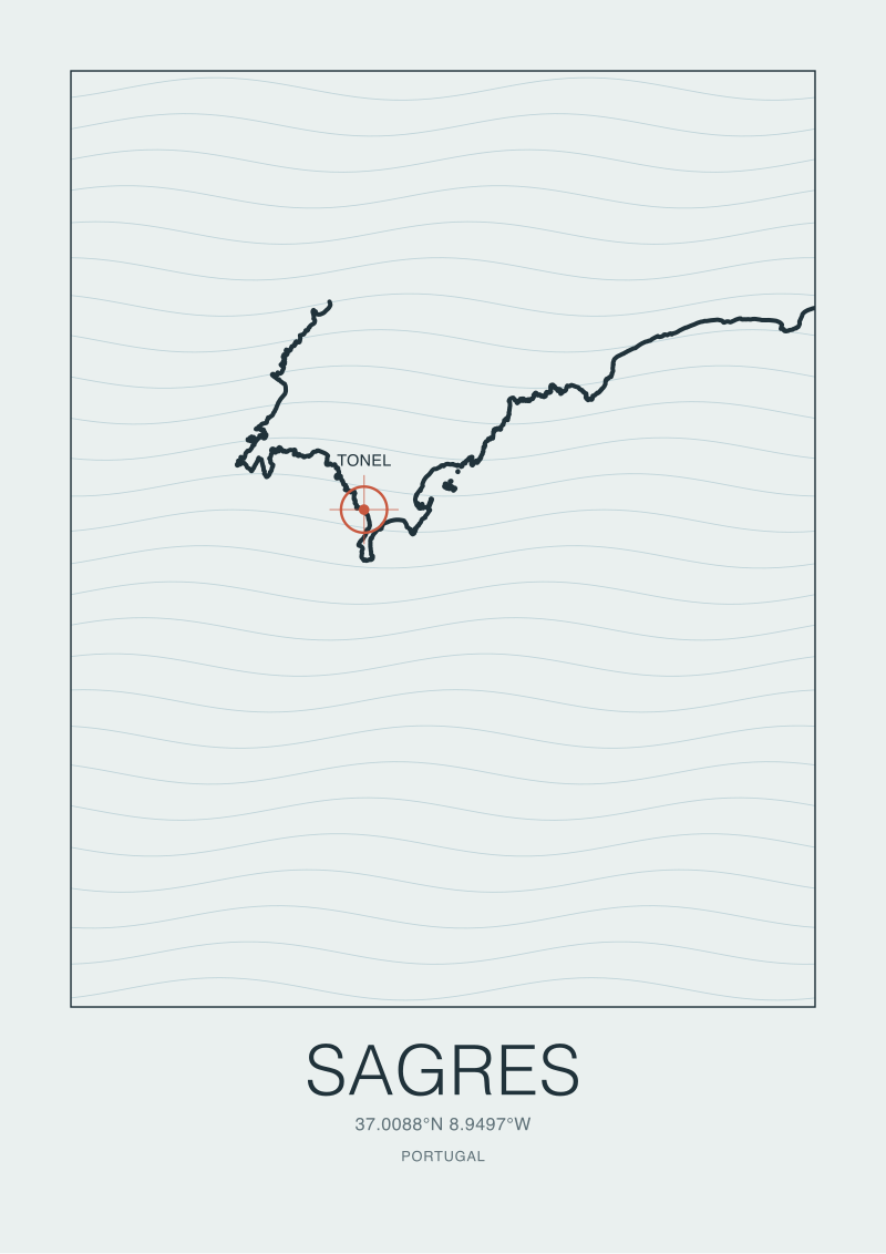 Sagres
The print from this article · from €29.95
View the print →
Sagres
The print from this article · from €29.95
View the print →
Question 3: Is the Print Going in a Quiet Room or a Loud One?
The third question is not about the coast at all. It is about the room. Framed coastline prints do very different work in a bedroom, in a hallway, above a dining table, or in a rented flat with white walls and no other art. Before you choose between Sagres and San Sebastián, ask what surface you are actually asking the print to hold.
A quiet room is one where the print is one of the few objects competing for attention: a bedroom with a low bed, a study with a single bookshelf, a hallway with nothing else on the walls. In a quiet room, the eye has time. It will follow every inlet, every headland, every letter of the small type at the bottom of the plate. Complexity is welcome — it gives the eye something to do.
A loud room is one where the print is competing with other visual weight: shelves of books, plants, other art, a busy sofa, a kitchen with open storage. In a loud room, the eye moves fast. A print that requires study will lose. What survives is silhouette — the overall shape read from three metres away.
If the Room Is Quiet: San Sebastián Rewards You
In a quiet room, put San Sebastián. The Bay of La Concha alone can carry an evening of looking. The Urumea mouth, the Zurriola breakwater, the way the coastline pinches at the port — the plate has more information per square centimetre than Sagres does, because the geography has more turns per kilometre. In a room that lets you approach the print and stand a foot away, San Sebastián will keep giving.
If the Room Is Loud: Sagres Holds Its Ground
In a loud room, put Sagres. Read from across a kitchen or over a full bookshelf, the Sagres coastline resolves into one clear shape: a corner. The land turns from a south-facing coast to a west-facing coast at the Cabo, and that turn is legible at any distance. The Atlantic reads as negative space. Because there is less line and more paper, the print does not compete with the objects around it — it acts as a pause. That is a specific job, and Sagres is built to do it.
If You Answered Everything: The Recommendation Table
Three questions, two answers each, eight possible routes. The table below maps every combination to a single-sentence recommendation. Q1 asks whether you want open ocean (Open) or a coast that cups a city (City). Q2 asks whether you are drawn to a headland (Head) or an urban beach (Urban). Q3 asks whether the room is quiet (Quiet) or loud (Loud).
| Q1 | Q2 | Q3 | Recommendation |
|---|---|---|---|
| Open | Head | Quiet | Sagres — the coast, the culture, and the room all agree; this is the clearest yes in the table. |
| Open | Head | Loud | Sagres — the silhouette carries the loud room, and the geography carries the meaning. |
| Open | Urban | Quiet | San Sebastián — culture and room outvote coast shape; Zurriola inside a city is what you actually want. |
| Open | Urban | Loud | Sagres, but a small format — you want open water, and Zurriola will not read from across a loud room. |
| City | Head | Quiet | San Sebastián — the enclosed bay geometry rewards close looking, even if the headland story pulls elsewhere. |
| City | Head | Loud | Sagres — a headland pull plus a loud room means silhouette wins; take the cape and revisit later. |
| City | Urban | Quiet | San Sebastián — every axis agrees; the print will be read many times over years in a quiet room. |
| City | Urban | Loud | San Sebastián in a larger format — the bay curve is legible at scale even in a busy room, if the print is big enough to insist. |
Two patterns are worth naming inside the table. First, when all three answers agree, the choice is not hard, and the print will settle into the room quickly. Second, when Q3 disagrees with Q1 and Q2, the room usually wins — a coast print that cannot be read from where you stand is not doing its job, regardless of how strong the geography is on paper. Format size can rescue a mismatch, but only up to a point. If you are unsure, measure the wall first and choose the coast second.
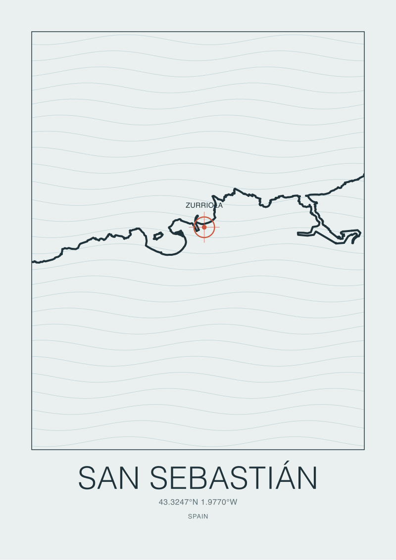 San Sebastián
The print from this article · from €29.95
View the print →
San Sebastián
The print from this article · from €29.95
View the print →
A Closing Note From the Table
We drew both plates from the same OpenStreetMap `natural=coastline` layer under the Open Database License, at the same scale, in the same ink weight. That is a deliberate constraint. The comparison between Sagres and San Sebastián is only honest if the drawing method does not favour one over the other. Both prints are available at see the Sagres print in the studio's standard formats.
FAQ
Which coastline has more visual detail on the print at the same scale?
San Sebastián carries more detail per square centimetre. The coastline folds through the Bay of La Concha, the Urumea river mouth, and the Zurriola breakwater within a very short linear distance, so an OpenStreetMap coastline extraction at any given scale resolves into many more turns. Sagres, sitting on a cliffed cape, has long stretches of near-straight shoreline. That is not a quality difference — it is a geometry difference, and it directly shapes how the two prints read on a wall.
Can I choose based on which surf break is better?
No, and that is deliberate. The studio draws coasts, not conditions. Tonel at Sagres and Zurriola at San Sebastián are both documented, well-established breaks, but ranking them would require wave-forecast reasoning we do not do. The choice between the two prints should be made on coastline shape, cultural context, and the room the print is going into — the three questions above. Anything else drifts into surf-media territory that the studio does not occupy.
Do the prints show surf spots as markers?
The plates locate the known-for break — Tonel for Sagres, Zurriola for San Sebastián — with a small mark and a label, tied to the coordinates in the studio's grounding data. The coastline itself is the main subject, and the spot marker is one point of reference, not the visual centre. If you prefer a version with no spot marker, we can produce that on request; the underlying coastline layer is the same.
What is the source of the coastline data?
Both plates are drawn from OpenStreetMap's `natural=coastline` tagging, pulled via the Overpass API and released under the Open Database License. Attribution is printed in the lower margin of every plate. Using the same source for both prints is what allows an honest comparison — the drawing method, projection, and simplification tolerance are identical, so any difference in the finished print reflects a real difference in the coast.
Is there a size that suits both coasts equally?
Not really. Sagres tolerates smaller formats because its meaning survives when reduced — the cape shape is legible at any size. San Sebastián needs a larger format to earn its density; below a certain size the fine coastline detail collapses into a smudge and the print stops rewarding close looking. If you want both prints in the same room at the same size, expect Sagres to feel more considered and San Sebastián to feel slightly compressed.
Which print pairs better with other coast prints in a series?
Sagres pairs cleanly with other headland and cape prints — places where the land ends decisively. It sits well next to Cabo de São Vicente studies, Cornish headlands, or Norwegian capes. San Sebastián pairs with other urban-beach and bay prints, where the coastline turns inward and human settlement is legible. Mixing the two categories in a wall grouping is possible, but the shift in coastline density between them can read as inconsistent unless mediated by a third print.
Do you offer prints of both together as a diptych?
We do produce diptychs on request when two coasts share a defensible geographic argument. Sagres and San Sebastián do not share one obvious argument — different sea, different geometry, different cultural inheritance — so we typically recommend choosing one rather than pairing them. If you want a two-print pairing, Sagres reads more naturally next to another Atlantic cape, and San Sebastián next to another Cantabrian or Basque coast city. Ask the studio and we will suggest options.
New breaks and 10% off your first print.
One email now with your code. No noise after.