Most surf prints get drawn wave-first. Ours don't. The Ericeira print begins as a single coastline trace pulled from OpenStreetMap's `natural=coastline` layer via the Overpass API, released under the ODbL — a real geographic object before it is a design object. Ribeira d'Ilhas sits at 38.9885° N, 9.4197° W on that trace, and everything else on the sheet — the weight of the ink at the headland, the negative space west of the shore, the small mark where the spot lives — is a decision made against that fixed geometry. This piece walks through those decisions in the order the studio makes them.
Why We Start With the Coastline, Not the Wave
There is a common way to design a surf print, and it is the wrong way for us. The common way opens a blank canvas, sketches a wave curl in the middle third of the composition, and stitches a place name underneath it. The wave is invented, and the place is a caption. That approach produces posters that are handsome on a wall and completely interchangeable — swap "Ericeira" for "Peniche" and nobody looking would know.
We invert the order for a reason that matters to us and, we think, to anyone who lives with a print for years. The shape of a coast is not decorative. It is the reason a wave exists in the exact spot it exists. Ribeira d'Ilhas breaks the way it breaks because the shoreline in front of it bends the way it bends and the seabed drops away the way it drops away. If you draw the wave first and place the coast underneath as a courtesy, the print is telling a story it cannot back up. If you draw the coast first — the real coast, pulled from a data source you can name — the wave has somewhere true to sit.
The other reason is quieter. A coastline drawn from real data has a rhythm no illustrator invents by hand. Small inlets, an unexpected straight run, a headland that sits further out than memory suggests. Those irregularities are what make the sheet feel like a place rather than a mood. Our first pass is always the trace. Only then do we decide what to add and, more often, what to leave alone.
The Source File: OpenStreetMap, Overpass, and What ODbL Means for a Print
The base geometry comes from OpenStreetMap's `natural=coastline` tag, queried through the Overpass API. Overpass is the way you ask OSM specific questions — in our case, "give us every way tagged as coastline within this bounding box around Ericeira" — and return the raw node coordinates that make up the line. Those coordinates are not aesthetic choices. They are the result of thousands of contributors tracing satellite imagery and, in many stretches, walking the shore with GPS. The line has authorship, and we treat it as such.
OSM data is licensed under the Open Database License, or ODbL. In plain terms, the ODbL lets us use the data commercially, including on a print sold in the studio's shop, provided two conditions hold. First, the source is attributed — every Ericeira print carries a small line crediting OpenStreetMap contributors on the back of the sheet. Second, if we produce a derived database (say, a cleaned coastline file we then share), that derived database is licensed under the same terms. A finished print is a "produced work" under the ODbL, not a derived database, which is why the visible design is ours while the attribution to OSM is non-negotiable. We would carry that credit even if the license did not require it.
Working from ODbL data changes the meaning of the object on the wall. When someone points to the headland north of Ribeira d'Ilhas and asks whether it really looks like that, the answer is yes — that curve is a chain of latitude and longitude values a real person contributed to a public database, and anyone with a browser can pull the same query and compare. The print is falsifiable, in the useful sense of the word. That is a rare property for wall art.
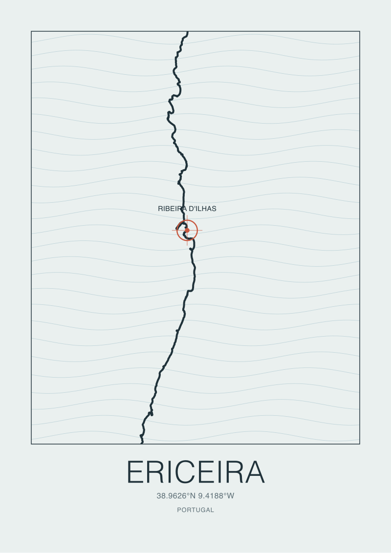 Ericeira
The print from this article · from €29.95
View the print →
Ericeira
The print from this article · from €29.95
View the print →
Ribeira d'Ilhas at 38.9885, -9.4197: Anchoring the Spot on Real Coordinates
Ribeira d'Ilhas is the anchor point of the composition, and it sits at 38.9885° N, 9.4197° W. Those two numbers do more work than they look like they do. They set the vertical position of the spot mark on the sheet, they determine how much coastline sits above and below the mark in the frame, and they force the aspect ratio of the print — the ratio of horizontal ocean to vertical shore that the coordinates naturally imply once you decide how much surrounding coast to include.
We do not round the coordinates. A print that placed the spot at, say, 39.00° N and 9.42° W would sit roughly 1.3 kilometres north of the true break. On a sheet the size of a wall print, that is a visible shift — the headland relationship changes, the small bay to the north reads differently, and a Ericeira local would notice inside a second. Four decimal places on latitude and longitude puts the mark within about eleven metres of the true point at this latitude, which is the resolution the printed dot can honour. Any more precision would be theatre. Any less would be sloppy.
The spot mark itself is deliberately quiet. It is not a wave icon, not a surfer silhouette, not a starburst. It is a small filled circle with a hairline stroke around it, sized to be findable at reading distance and inconspicuous from across the room. The reason is that Ribeira d'Ilhas is a place before it is a break, and the mark is a geographic pin, not a badge. A visitor who has never surfed will read the sheet as a coast with a landmark on it. Someone who has paddled out there will read the same sheet as a portrait of a break they know. Both readings are correct, and neither is louder than the other.
The Marks You See on the Paper: Ink Weight, Headland, and Negative Space
Once the trace is placed and the spot anchored, the studio work becomes a series of small decisions about weight. The coastline is not printed as a single uniform line. It is drawn with variable ink weight — heavier at the headland immediately north of Ribeira d'Ilhas, lighter along the softer stretches, and briefly thickened again where a small point interrupts the run to the south. The weights are not random. They correspond to features that do the actual work of the coast: the promontories that shelter, the flatter runs that expose, the small interruptions that shape the near-shore water.
The headland is the loudest mark on the paper for a specific reason. It is the geographic feature that most directly explains why Ribeira d'Ilhas sits where it sits. A reader who follows the ink from the spot mark northward hits the headland almost immediately, and the visual weight is doing the same job the headland itself does in the water — it stops the eye, the way the land stops a certain angle of swell. This is not symbolism grafted onto the design. It is the design honouring what the geometry already says.
Then there is the negative space west of the shore. The blank paper to the left of the coastline is not empty; it is the Atlantic, held as unmarked white so the coast can carry the composition without contest. We resist the urge to fill that space with wave lines, compass roses, or decorative typography. A wave line drawn in that white would be a wave we invented, and we do not invent waves. The compass rose would be an ornament pretending to be information. The negative space is, in the studio's private phrase, the honest part of the print — the part that admits how much of the ocean a single sheet of paper cannot possibly hold.
Latitude and longitude tick marks sit at the edges of the frame, unlabelled in the main composition and identified in a small key at the base of the sheet. They are the print's receipts. They say, quietly, that the coast you are looking at is at these coordinates and no others, and you can check.
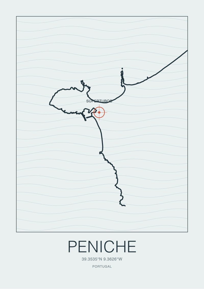 Peniche
The print from this article · from €29.95
View the print →
Peniche
The print from this article · from €29.95
View the print →
What the Print Deliberately Leaves Out
A print is defined as much by what it refuses as by what it includes. This one refuses several things, and each refusal is deliberate.
It does not show a wave. There is no curl, no lip, no cross-section of a barrel anywhere on the sheet. Wave illustration is where surf prints usually go to invent, because the specific shape of a wave on any given day cannot be drawn from a fixed data source. We would be guessing, and a guessed wave over a real coastline would undo the credibility the coastline earned. Readers who want a wave in the room can hang one. On our sheet, the wave lives in the reader's imagination, cued by the mark and the coastline but never illustrated.
It does not carry weather. No wind arrows, no swell direction diagrams, no forecast overlays. A print is a permanent object, and weather is the least permanent thing about a coast. Any weather rendered on paper would be either fictional or hopelessly out of date the moment the ink dried. The coast persists; the day does not.
It does not show hotels, restaurants, parking areas, or any other visitor infrastructure. Ericeira has all of that, and it is easy to find on any travel map. This print is not a travel map. It is a portrait of a stretch of Portuguese coast at a specific pair of coordinates, and the human overlay would compete with the geography for attention while adding information the reader can find in ten other places.
It does not include a ranked list of nearby breaks, a star rating, or any of the ranking iconography that has crept into surf illustration in recent years. Ribeira d'Ilhas is on the sheet because the coordinates put it on the sheet, not because we are ranking it against Coxos or Cave. Rankings belong to guidebooks. Coordinates belong to prints.
The only commercial gesture on the object is a small line, on the back, telling the reader that the print itself is available at the studio's shop alongside our other European coast pieces. That is the entire commercial footprint. We are not upselling accommodation, gear, lessons, or trips. The print is the product, and the coastline is the reason it is worth owning.
FAQ
What is the exact data source for the Ericeira coastline on this print?
The coastline is queried from OpenStreetMap using the Overpass API against the `natural=coastline` tag within a bounding box around Ericeira. That tag identifies mean-high-water lines contributed by OSM mappers from satellite imagery and on-the-ground GPS traces. The raw output is a sequence of latitude and longitude nodes, which becomes the geometric spine of the print. Nothing about the shore's shape is illustrator invention.
Why do you cite ODbL on every print?
ODbL is the Open Database License that governs OpenStreetMap data. It permits commercial use of the underlying coordinates in a produced work like a print, provided the source is attributed. Every Ericeira print carries an OpenStreetMap contributors credit on the back of the sheet. We would keep that credit regardless of the license, because attributing the people who traced the coastline is part of what makes the object honest.
Are the coordinates 38.9885° N, 9.4197° W really precise enough for a wall print?
Yes, and deliberately no more than that. Four decimal places on latitude at this latitude corresponds to roughly eleven metres on the ground, which is finer than the diameter of the printed spot mark itself. Adding more decimals would suggest a precision the ink cannot honour; using fewer would put the mark visibly off the true break. The precision matches the medium.
Why isn't there a wave illustrated on the print?
Because a specific wave cannot be pulled from a fixed geographic data source. Any wave we drew would be invented, and an invented wave sitting on top of a real coastline would compromise the credibility of everything else on the sheet. The print names the spot, marks its coordinates, and shapes the coast so the reader understands where waves happen. The wave itself lives in the reader's memory or imagination.
What is the small mark at Ribeira d'Ilhas actually indicating?
It is a geographic pin at 38.9885° N, 9.4197° W — the coordinates of the break within the OSM coastline reference frame. It is drawn as a small filled circle with a hairline stroke so it reads as a landmark rather than a badge. A viewer with no surfing context sees a coast with a specific point identified; a viewer who knows the break recognises it. Both readings are intended.
Can I request other European surf coasts drawn to the same standard?
The studio is progressively releasing prints for European surf coasts drawn from the same OSM-plus-Overpass source pipeline and to the same design discipline. Current and upcoming coasts are listed on the shop page. Each new sheet begins with a coastline query and an anchoring set of coordinates, so the standard the Ericeira print sets is the standard every print in the series inherits.
Why is there so much blank space on the ocean side of the sheet?
The white to the west of the coast is the Atlantic, held unmarked on purpose. Filling it with wave lines, decorative currents, or a compass rose would either invent information or ornament the sheet with fake information. The negative space is the print's admission that a single piece of paper cannot render an ocean, and the honest response is to let the white stand for what it is.
New breaks and 10% off your first print.
One email now with your code. No noise after.