There is a pattern we notice every time somebody sets a bathymetric chart of Biarritz on the studio table and starts counting contour lines. The exercise always begins the same way — thirteen or so charted depths pulled off the plate around the Grande Plage headland at roughly 43.4853°N, 1.5584°W, arranged as if the seabed were a staircase — and it always ends with the same quiet disappointment when the ocean refuses to behave like the drawing. Reading a coastal profile is not counting numbers. It is reading a negotiation between rock, sand, swell, and the surveyor who last passed through.
The Contour Line Illusion: Why Charted Depths Flatten a Living Seabed
There is a pattern in how first-time chart readers approach Biarritz's shelf: they treat the printed isobaths as if each one were a shelf edge you could stand on. The five-metre line, the ten, the twenty — laid down in tidy blue, they read as terraces. They are not terraces. They are the surveyor's best interpolation between soundings that were, on the day the plate was drawn, spaced further apart than most readers imagine.
Hydrographic offices publish contours as continuous curves because that is the only honest way to render sparse point data at chart scale. Between two soundings four hundred metres apart, the seabed can do almost anything a rock and a current will allow, and the contour draftsman has to pick a plausible line. Off the Grande Plage that plausible line is heavily influenced by the geology the surveyor already knows — the Pyrenean bedrock tilting west, the Flysch outcrops that surface as the reefs of the Côte des Basques a kilometre south, the sand mantle that thickens and thins with every winter. The line you see is a hypothesis dressed as a fact.
The second flattening is temporal. Coastal charts are updated on cycles measured in years or decades for the offshore blocks, and even the harbour approaches — where update pressure is highest — see full resurveys only when a project or an incident forces the budget. A depth marked in metres beside a small cross on the Biarritz plate might be a sounding from a modern multibeam pass or it might be a leadline reading inherited from an earlier century, carried forward because nothing has contradicted it. Both count as "charted depths" on your table. Only one of them is telling you what the seabed looks like this decade.
The third flattening, and the one that misleads even careful readers, is scale. A print chart at the scale most people consult compresses a wave-relevant feature — a bar, a rip channel, a reef finger — into a width smaller than the line itself. The break at the Grande Plage sits inside that compression. What the eye reads as a smooth slope from beach to twenty metres is, in the field, a corrugated floor of sand ridges, shell hash, and the odd bedrock knuckle. Counting thirteen numbers off a chart and calling that a "seabed profile" is a bit like counting the letters in a paragraph and calling that the argument.
The Sandbar Drift: How a Beach Break's Floor Moves Between Surveys
The second pattern we watch for is the reader who compares two charted depths from different editions of the Biarritz plate and concludes the seabed has changed. Sometimes it has. More often the sandbar has, and the survey line simply passed through a different sand geometry on each pass.
A beach break's seabed is not a fixed thing that occasionally gets remeasured. It is a mobile system whose principal moving parts — the bars, the troughs, the rip channels between them — reorganise themselves every winter under Atlantic swell and reset again during calmer spells. The Grande Plage is a textbook case: an open, north-west-facing beach exposed to the full arc of Bay of Biscay swells, backed by a headland that redirects longshore transport, fed and starved of sand on a rhythm the chart cannot capture. A bar that sat three hundred metres offshore in one autumn's survey may sit two hundred and forty in the next, at a slightly different depth, with a rip channel pushed sideways by winter storms. The chart cannot lie about what it measured. It can only mislead about what remains true.
This is why "seabed profile comparison" between charts of Biarritz, taken as evidence that the coast is deepening or shoaling, needs to be handled with the same suspicion a serious analyst applies to any two data points collected under uncontrolled conditions. The soundings were correct. The interpolations were reasonable. The seabed genuinely is different — but "different" here often means "the sand is arranged differently this year", not "the coastline is eroding at rate X". Distinguishing the two requires either a multi-decadal series with enough passes to average out the sand cycle, or a bedrock-focused reading that ignores the sand layer entirely and looks at what sits beneath it.
The corollary matters for anyone reading a Biarritz chart to understand where waves break. The break at any given beach section is a function not of the twenty-metre contour offshore but of the two- to six-metre sand geometry a couple of hundred metres out. That geometry is exactly the layer the chart is worst at pinning down. You are, quite literally, reading the wrong depths for the question you are asking.
A chart tells you where the surveyor stood; the swell tells you where the sand is today, and those two answers only agree by accident.
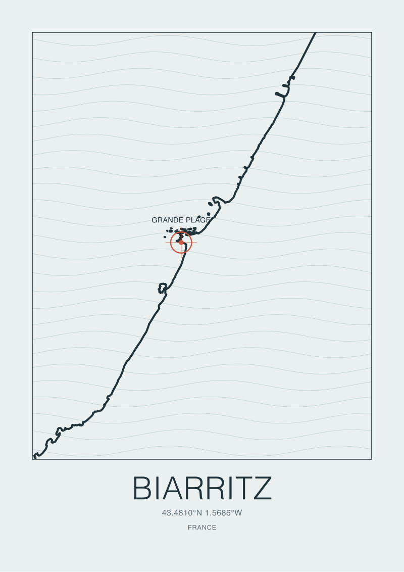 Biarritz
The print from this article · from €29.95
View the print →
Biarritz
The print from this article · from €29.95
View the print →
The Refraction Fingerprint: Reading Bathymetry Backwards From the Break
The third pattern is more useful, because it works in the opposite direction. Rather than reading the seabed forwards from a chart to predict what breaks, the more honest cartographic exercise off Biarritz is to read the breaks backwards to infer the seabed. Waves are, among other things, high-frequency bathymetric sensors that survey the coast for free every time a swell arrives.
The physics is settled and does not need embellishing. As a swell moves from deep water into shallow, its phase speed slows in proportion to the square root of depth. When one part of a wave front sits over shallower ground than the part beside it, the shallower section slows first and the faster deep-water section swings around it. That swinging is refraction, and it is the mechanism by which a straight-line swell arriving from the west arranges itself into the curved, focused, decidedly non-uniform pattern of breaks the Grande Plage displays on any given day. The break lines you can trace from the headland on a swell morning are the seabed drawing itself with water.
For a cartographer this is a gift. A persistent hot spot — a peak that reliably steepens and breaks at a particular tide and swell direction — is telling you there is a bathymetric high beneath it that focuses energy. A dead zone that consistently underperforms neighbouring stretches is telling you there is either a deeper channel dispersing energy or a soft bottom absorbing it. Compared to the print chart, the refraction fingerprint has two advantages: it integrates the entire nearshore seabed at wavelength-scale resolution, and it updates itself in real time as sand moves. Its disadvantage is that it only reads the seabed where swell of the right period is currently breaking — a partial map, refreshed constantly.
The best readings of the Biarritz shelf we have ever seen on the studio table combined both sources honestly. The chart provided the deeper structural frame: the general slope from the headland, the position of the rocky outcrops to the south, the approximate reach of the sand mantle. The refraction pattern, watched over a season, provided the fine grain — where the bars had settled that year, where the rips ran, where a bedrock knuckle showed through a thinning sand cover. Neither would have got there alone. The chart was too static; the wave field was too partial. Together they behaved like a proper survey.
The Nearshore Blind Spot: Where Charts Off Biarritz Go Quiet
The fourth pattern is the one that costs analysts credibility. It is the tendency to speak with confidence about the nearshore seabed — the inner two hundred metres from the beach, where the surf zone actually lives — using a chart whose data density inside that zone is deliberately low.
Hydrographic priorities are set by shipping. The soundings that feed a chart plate are densest along navigational approaches, harbour mouths, and anchorage areas — the places where a keel is at risk. Off a public beach with no commercial approach, the interior surf zone is not a survey priority; it is often a hazard zone the chart labels and asks vessels to avoid. That labelling, sensible from a mariner's point of view, produces a specific artefact: the shallowest, most wave-relevant water off the Grande Plage is precisely the water the chart knows least well. The contours you can trace with confidence are the ten, the twenty, the forty. The two and the five, if they appear at all, are frequently drawn from a much older or much sparser data set than the deeper lines beside them.
This is the "thirteen charted depths" problem in its honest form. If you pull thirteen sounding numbers off the plate around Biarritz, several of them will be from the well-surveyed deeper shelf and behave reliably; several will be from the intermediate zone and behave reasonably; the shallow ones nearest the beach will carry error bars the chart does not print. A comparison that treats all thirteen as equally weighted evidence for a seabed profile is doing violence to the underlying data. It is comparing a well-surveyed offshore number to a lightly surveyed inshore number as if they were the same species of fact.
There is a related quiet in the vertical. Charted depths are referenced to a chart datum — a low-tide surface chosen for navigational safety, not for surf-zone description. The tidal range at Biarritz is significant enough that the effective depth at any given moment differs materially from the chart figure. A "two-metre" spot at chart datum is a very different animal at high spring tide, when it is deep enough to let a swell pass over cleanly, versus at low, when it is shallow enough to break the same swell hard. The chart does not lie about this either — it publishes tidal tables alongside — but a bare "13 charted depths" comparison drops the tidal layer entirely and reports as if depths were static. They are not.
Two consequences follow. First, any Biarritz seabed comparison that does not distinguish between deep-shelf soundings and nearshore ones is over-claiming precision. Second, any comparison that reports depths without tidal referencing is over-claiming permanence. Both errors are common. Both are avoidable. Neither requires new data — only an honest accounting of what the existing data actually says.
So What Do You Actually Do
Read the chart the way a cartographer reads their own draft: as a hypothesis stitched together from unevenly distributed evidence, tightest where ships need it, loosest where surf lives. When you pull depths off the Biarritz plate, separate them into the deep-shelf tier, the intermediate tier, and the nearshore tier before you compare anything. Treat the deep numbers as strong evidence for slope and structural context. Treat the intermediate numbers as decent evidence for the sand-mantled shelf. Treat the nearshore numbers as indicative, tide-referenced, and sand-mobile — not as facts to build an argument on.
If you want to understand what the Grande Plage seabed is actually doing right now, do not chase a newer chart. Chase the wave field. Watch where the swell focuses across a season, where the rips consistently drain, where the break lines curve toward or away from the headland at different swell directions. Those observations, cross-referenced against the chart's structural frame, will give you a working model of the seabed with far more resolution than any single sounding can offer. The chart is the map. The waves are the survey. Neither works alone.
And keep an honest ledger of what would change your mind. Three signals, specifically, are worth watching if you care about the Biarritz seabed as a system: whether the harbour approach is resurveyed with modern multibeam in a given cycle (that data usually spills into the adjacent beach reads); whether an unusually stormy winter reorganises the bar geometry in a way that persists through the following summer; and whether a stretch of the Grande Plage that has been a reliable break simply stops working for a season, which is often the earliest visible sign that the sand mantle above the bedrock has shifted underneath. When any of the three moves, redraw the map. Until then, hold the thirteen numbers lightly. They were never trying to be more than a sketch.
For readers who prefer to keep this kind of thinking on the wall rather than in a folder, our studio prints of the Biarritz coastline — drawn from the same public bathymetric and coastline datasets we've been arguing with here — are collected at /shop/.
FAQ
Why do bathymetric contours off Biarritz sometimes disagree between chart editions?
Because contours are interpolations drawn between soundings, and the underlying soundings do not all come from the same survey or the same decade. When a new resurvey adds density in one zone, the redrawn contour there will differ from the previous edition even if the seabed itself has not changed materially. Combine that with genuine sand movement in the nearshore, and two "correct" charts can produce visibly different lines for the same stretch of coast.
Can a chart tell me exactly where a wave will break off the Grande Plage?
Not reliably. The break depends on sandbar geometry in the inner two to six metres, which reorganises each winter and is precisely the zone charts survey least densely. A chart gives you the structural frame — the general slope, the position of bedrock outcrops, the reach of the sand mantle — but the specific peak on a given day is set by sand that has moved since the last survey. Read the frame from the chart; read the specifics from the water.
What does "chart datum" mean when I compare charted depths at Biarritz?
Chart datum is a low-tide reference surface chosen so mariners see conservative depths. All soundings on the plate are relative to that surface, not to mean sea level. Because Biarritz has a meaningful tidal range, a depth printed on the chart differs from the depth at any given moment by whatever the tide is doing then. Any serious comparison of depths — especially in shallow water — needs to be tide-referenced before it means anything.
Is the "thirteen depths" approach a legitimate way to compare seabed profiles?
As a rough sketch, yes. As evidence for a claim about how the seabed has changed, no. The thirteen numbers will span zones of very different survey quality — deep shelf soundings that are trustworthy, intermediate soundings that are reasonable, nearshore numbers that carry hidden error bars — and treating them as equal-weight data points over-claims precision the underlying chart does not support.
Why is the nearshore zone off Biarritz surveyed less than the offshore shelf?
Hydrographic budgets follow shipping priorities. Navigational approaches, harbour mouths and anchorages get repeat multibeam coverage because keels are at risk there. A public beach with no commercial approach is typically labelled as a hazard zone rather than densely surveyed, so the shallowest and most wave-relevant water — the surf zone itself — carries the sparsest and often the oldest data on the plate.
How can waves themselves be used to map the seabed?
Swell slows in proportion to the square root of depth, so a wave front crossing an uneven seabed bends around shallower ground. That bending — refraction — arranges straight incoming swell into focused peaks and quiet zones that draw the seabed with water. Persistent hot spots reveal bathymetric highs beneath them; persistent dead zones reveal channels or absorbent floors. Watched over a season, the wave field is a self-updating survey at wavelength-scale resolution.
Does erosion off Biarritz show up in charted depths?
Sometimes, but disentangling structural erosion from seasonal sand movement requires a long series of surveys and a bedrock-focused reading rather than a sand-surface one. Two chart editions showing different nearshore depths are more likely to reflect where the sandbars sat on each survey day than a directional change in the coastline. A defensible erosion claim needs decadal averaging or a survey method that reads through the sand mantle to the rock below.
What is the single most useful thing to know before comparing depths off any Biarritz chart?
That the chart is denser and more current where ships go, and sparser and older where waves break. Once you internalise that asymmetry, most seabed comparisons rewrite themselves. You stop treating a nearshore two-metre reading and an offshore twenty-metre reading as the same species of fact, and you start weighting each depth by the survey confidence behind it rather than by the size of the number.
New breaks and 10% off your first print.
One email now with your code. No noise after.