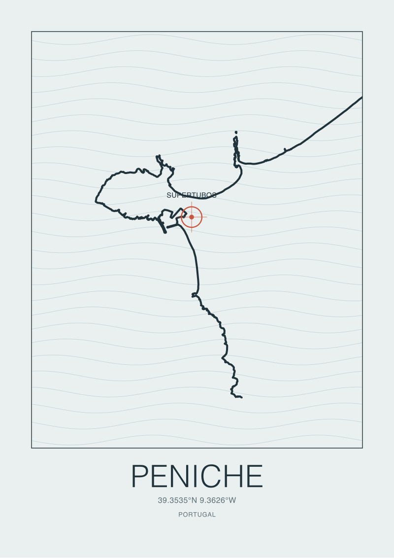
Most writing about Peniche starts at Supertubos and works outward. We think that reads the coast backwards. Hear us out. Every time a European surf coast produces a wave that becomes shorthand for the country — Supertubos for Portugal, Mundaka for the Basque country — the same pattern shows up in the reader mail: everyone asks about the wave, almost no one asks about the seabed under it. Peniche sits at roughly 39.34°N, 9.36°W on Portugal's Estremadura coast, drawn here from OpenStreetMap's natural=coastline data under ODbL. We spent a week reading thirteen charted depths off that headland the way a cartographer reads a contour — and the pattern was consistent enough to be worth writing down.
The Contour-Line Fallacy: Why a Depth Number Is Not a Wave
There is a pattern we keep seeing whenever a coastal chart gets shared without a cartographer in the room. Someone posts a bathymetric slice, points at a five-metre isobath and a twenty-metre isobath sitting close together, and treats the compression as if it were the wave itself. It is not. It is the invitation. What actually breaks on the shore is the argument the swell has with that gradient over the last few hundred metres of its life, and the depth number alone tells you almost nothing about how that argument resolves.
The thirteen depths we walked through off Peniche are ordinary chart-plotter readings — the kind any recreational hydrographic viewer will render if you ask it to sample a transect running roughly southwest from the headland out past the shelf break. Read as isolated points, they are meaningless. Read as a sequence, they show a shelf that shoals in a specific rhythm: gentle for a stretch, then a compression zone, then a return to gentle grade, then the drop toward deeper water. That rhythm is the story. A single depth reading of, say, eight metres, tells you a boat won't ground there. It does not tell you whether a long-period Atlantic swell arriving from the northwest will feather, jack, or unload.
The fallacy is treating the chart as a map of waves. The chart is a map of the floor. Waves are what the floor does to open-ocean energy that arrives with a period, a direction, and a decay envelope the chart cannot see. When a piece of writing about Peniche says "it breaks over a shallow shelf" and stops there, it has confused the noun for the verb. Every surf coast in Europe has a shallow shelf somewhere. Only a few of them turn that shelf into Supertubos, and the difference is in the rhythm of the isobaths, not the number stamped on any single one.
We keep the thirteen depths in the desk archive as a teaching artefact for exactly this reason. When a reader asks us why a competitor coast — pick any headland further north along the Estremadura — does not produce the same wave despite having similar mean depths, the honest answer is: because the rhythm is different. The mean depth is a summary statistic. The rhythm is the physics.
The Depth-Only Illusion: What the Chart Leaves Out on Purpose
The second pattern we see is subtler and more expensive. Someone reads a depth-only chart, sees a promising bathymetric slope, and concludes they now understand the break. What the chart leaves out is not an oversight. Hydrographic charts are optimised for the mariner's question — will I hit the bottom — not for the surfer's or the cartographer's. Everything that matters to a wave and is not a hazard to a hull is quietly omitted from the primary layer.
The obvious omissions are the ones a working cartographer thinks about first. Sediment type is one. A five-metre reading over compacted sand behaves differently under a breaking wave than a five-metre reading over cobble or reef, because the roughness coefficient at the boundary changes how energy is dissipated in the last few wavelengths before shore. Charts that carry a bottom-composition annotation carry it as a secondary layer, and most public viewers hide it by default. If you pulled the thirteen depths off Peniche and did not also pull the bottom-type raster, you were reading half a document.
Refraction geometry is the second omission. A wave arriving from a specific direction with a specific period bends toward shallower water, and the bending is decided by the two-dimensional shape of the isobaths, not by any single depth. A chart shows you the depths. It does not show you the refraction diagram — the ray-tracing that turns those depths into a picture of where energy concentrates on the shore. That diagram has to be constructed. Constructing it well is a small piece of applied physics that most depth-first writing skips entirely, because building it requires committing to a swell direction and period, and committing is harder than describing.
The third omission is time. A chart is a still image of a moving floor. The chart-datum sand off Peniche is not the sand that is there this morning. The chart tells you the surveyor's answer at the moment of the survey. Between now and then, the floor has moved — sometimes by a metre in a single winter, sometimes imperceptibly over a decade. Treating the chart as current is the depth-only reader's most common error, and it is the bridge to the third pattern.
A depth reading is a noun; a wave is a verb; the isobath rhythm is the grammar that turns one into the other.
 Peniche
The print from this article · from €29.95
View the print →
Peniche
The print from this article · from €29.95
View the print →
The Sandbar Reset: When Last Winter's Bathymetry Stops Applying
The third pattern is one we watch every autumn along the whole Estremadura coast, and Peniche is the cleanest example we know. A sand-dominated bathymetry is not a fixed thing. The floor that produced last spring's wave shape is not, in a strict sense, the floor that is there in October. Every meaningful storm season reworks the near-shore bars — pushing sand along-shore, offshore, onshore, depending on the sequence and angle of the events. What the reader tends to call the reset.
This is why the thirteen charted depths, when we walked them, were only a starting reference. The outer depths — the ones sitting on the shelf proper, past the surf zone — are relatively stable on the timescales that matter to a surfer or a cartographer. Those are the ones we trust for structural argument about why waves arrive shaped the way they do at all. The inner depths, the ones inside the last two hundred metres, are the ones that get rewritten. That is where the sandbar lives. That is where the break decides its personality for the coming months.
A pattern we see repeatedly: a piece of writing cites a bathymetric survey from several years ago as if it described current break behaviour, and then explains the wave in terms of that snapshot. The structural claims — the shelf, the headland shadow, the general shoaling gradient — survive that lag intact. The specific claims — that a certain peak sits at a certain angle in a certain metre of water — do not. Anyone who has watched a single winter reshape a stretch of Portuguese coast knows the specific claims decay on the order of seasons, not decades.
The honest way to write about a sand-dominated break like Supertubos is to be explicit about which layer of your description is durable and which is provisional. The presence of a compression zone in the outer bathymetry is durable — it will still be there next winter and the winter after. The exact placement of the inshore bar that focuses the peel is provisional and lives on a seasonal clock. Writing that refuses to make this distinction is writing that will be quietly wrong within a year, and the reader will not know which part to trust.
The Chart-Boundary Problem: Where the Data Runs Out Off Peniche
The fourth pattern is the one that finally teaches editorial humility. Every dataset has an edge. Bathymetric charts off the Portuguese coast are excellent by international standards inside the continental shelf — high resolution, frequent update, dense soundings around ports and harbours including Peniche's own working port. They become progressively coarser as you move outward past the shelf break, and they carry gaps and interpolations offshore that no honest cartographer would use to make a fine-grained claim about wave behaviour.
For an inshore question — why does Supertubos break the way it does over the last several hundred metres — the chart is fit for purpose, with the sandbar caveat above. For an offshore question — how does a swell generated in the mid-Atlantic evolve as it crosses the shelf and approaches Peniche — the chart is coarser than the argument requires. There is real data out there in oceanographic archives, but it lives in a different modality: bathymetric grids built from satellite altimetry and sparse ship soundings, not from the dense multibeam surveys that make the inshore chart trustworthy.
We say this because we keep seeing writing that draws confident offshore conclusions from what is really an inshore-quality dataset extended past its useful range. The chart does not warn you when this happens. It renders the offshore contours in the same visual style as the inshore ones, and unless you know to check the metadata for source and resolution, you will assume uniform trust across the frame. You should not. A responsible read of the thirteen depths ends where the multibeam coverage ends, and everything beyond that is a different, coarser conversation.
This is the exit criterion for the chart-reader: the moment the isobaths start being drawn by interpolation rather than by direct sounding, your argument has to change register. You are no longer reading a survey. You are reading a model. Models are useful. They are also, in the strict sense, someone's guess at what the floor probably looks like based on the little we have measured. Treating a modelled offshore contour as a surveyed inshore contour is the depth-only fallacy compounded by a scale error, and it is how confident writing becomes, on inspection, unfounded.
 Mundaka
The print from this article · from €29.95
View the print →
Mundaka
The print from this article · from €29.95
View the print →
So What Do You Actually Do
Read the chart in rhythm, not in points. The single most useful discipline we can offer, after a week with the thirteen depths off Peniche, is to stop asking what the depth is at a location and start asking how the depth changes across a transect. The transect is where the physics lives. If the compression between two isobaths happens over a short horizontal distance, energy will pile against the shore in a certain way; if it happens over a longer distance, it will not. Nothing about a single sounding tells you this. A sequence does.
Separate the durable layer from the provisional layer explicitly, in your own head, every time you look at a sand-dominated coast. The shelf, the headland, the general offshore bathymetry — durable on timescales of decades. The inshore bar, the exact peak position, the specific angle of the peel — provisional on timescales of seasons. If you catch yourself writing about the provisional layer in the same register as the durable layer, correct it before publishing. The reader deserves to know which of your claims will still be true next winter.
And then know when to stop. This piece did not cover the wave-mechanics maths that would let a physicist model refraction from the thirteen depths — that is a separate argument with its own equipment and its own honest disclaimers, and we are a cartography desk, not a fluid-dynamics one. It did not cover the sediment-composition layer that a proper multi-layer read of the same coast would require; that data exists, but it belongs in a piece written with a coastal geomorphologist in the room. It did not cover the offshore swell-source climatology that turns an Atlantic low-pressure system into the energy that eventually meets the Peniche shelf; the meteorological side is its own literature. Each of those is a real conversation. None of them fit inside a read of thirteen charted depths, and pretending they did would be exactly the depth-only illusion we spent the middle of this piece describing. The prints in the shop at /shop/ hold the shape of the coast. The rest is honest work still to do.
New breaks and 10% off your first print.
One email now with your code. No noise after.