Four coordinates landed on the studio desk this week: Biarritz at 43.4853, -1.5584. Ericeira at 38.9885, -9.4197. Fuerteventura's El Cotillo at 28.6745, -14.0125. Hossegor's La Gravière at 43.6713, -1.4420. Each one is a single dot — a spot where a wave breaks against a specific shape of shore. The question we kept coming back to, staring at the plot, was the one buyers ask us before every commission: when a coast goes on your wall, what should you actually be looking at? Most people answer "the coastline". That answer is incomplete, and the gap is where bad prints live.
The Receipt: Four Coordinates, One Question
Look at those four numbers again, because they are the entire brief. Biarritz sits at 43.4853° N. Hossegor sits at 43.6713° N. The two are separated by roughly twenty-two kilometres of coastline along the same Atlantic-facing arc of southwest France, and yet the shape of the shore between them changes character three times: the rocky headlands and pocket beaches around the Grande Plage, the estuary of the Adour cutting east, and then the long straight sand corridor of Landes running north to La Gravière. A print that shows both towns on the same sheet is not a print of "one coast". It is a print of a negotiation between granite, river mouth, and dune field.
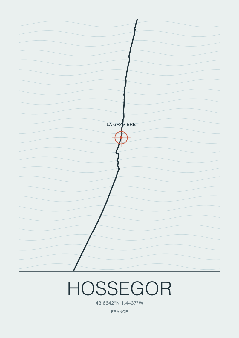
Now look at El Cotillo at 28.6745° N. That is fifteen degrees of latitude south of the French pair, on the western flank of Fuerteventura in the Canary Islands. Different plate, different swell fetch, different geology entirely — volcanic basalt against Atlantic instead of Pyrenean granite and Aquitanian sand. Ericeira at 38.9885° N sits between the two, on the Portuguese Estremadura coast. Four dots, four different arguments the sea is having with the land. When those dots become a wall print, you are being asked to trust that whoever drew it understood which argument they were rendering. Most of the time, the answer is nobody checked.
What the Numbers Actually Say About a Coast Print
Start with the coordinates themselves, because they are the first place a print can lie. A latitude and longitude pair pins a point on the WGS84 datum — the reference ellipsoid the global navigation system uses. Every coastline vector in OpenStreetMap, the source we use for those four dots, is defined against that same datum. If a printmaker sourced their coastline from a nautical chart drawn to a regional datum from the 1950s and never reprojected, the shoreline on the paper is offset from the point marked "spot" by anywhere between ten metres and two hundred metres. On a print sized 50 by 70 centimetres representing a stretch of forty kilometres, that offset is invisible. On a print sized 30 by 40 centimetres representing a single bay, it is the difference between a spot sitting on a beach and a spot sitting in a car park.
The second number worth reading is scale. A print that says "1:50,000" is telling you one centimetre on paper equals five hundred metres on the ground. A print that says nothing is telling you the maker either did not think about scale or does not want you to. Both are red flags, but for opposite reasons. A silent scale on a stylised piece is fine if the piece is honest about being stylised. A silent scale on a piece that markets itself as accurate is a print that will collapse under any reader who has actually stood on the shoreline it claims to show.
The third number is the resolution of the coastline data. OpenStreetMap's natural=coastline layer, licensed ODbL and pulled via the Overpass API, is a crowdsourced polyline where the density of vertices varies from beach to beach. In heavily surveyed European coasts — Biarritz, Ericeira, Hossegor — the vertex density is high enough that a print at studio scales renders the shape convincingly. In quieter volcanic coasts like the western Fuerteventura shoreline around El Cotillo, the polyline can be coarser. Not wrong, but simpler than reality. A good print acknowledges that in the legend. A bad print smooths the gaps and calls it style.
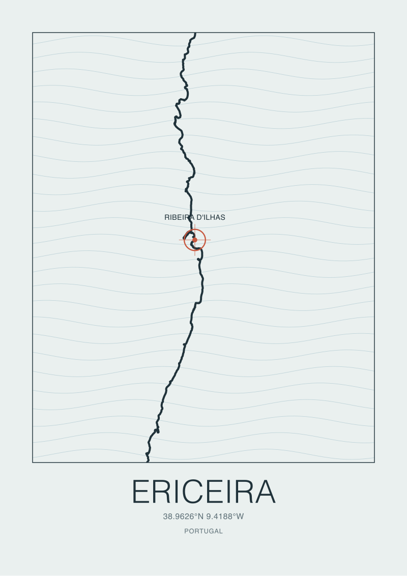 Ericeira
The print from this article · from €29.95
View the print →
Ericeira
The print from this article · from €29.95
View the print →
What Nobody Mentions: Projection, Scale, and the Coastline Paradox
Here is the part almost no wall-art listing on the internet will tell you. A coastline is not a length. It is a fractal, and its measured length depends on the length of the ruler you use. This is the coastline paradox, first formalised by Lewis Fry Richardson in the 1950s and popularised by Benoit Mandelbrot in 1967. Measure the Portuguese coast with a hundred-kilometre ruler and you get one number. Measure it with a one-kilometre ruler and the number is larger. Measure it with a one-metre ruler that traces every rock and inlet at Ericeira's Ribeira d'Ilhas and the number is larger still. There is no true length. There is only the length at a given resolution.
This has direct consequences for what you hang on your wall. Two prints of the same stretch of shoreline can look completely different — one crisp with headlands and inlets picked out, the other smooth and generalised — and both can be accurate at their respective resolutions. Neither is lying. The buyer who does not know the paradox exists will interpret the smoother print as "less detailed" and the sharper one as "more true", when in fact the honest question is: at what scale was this drawn to be read?
Projection is the second silent variable. A coast at 43° N (Biarritz, Hossegor) rendered in Web Mercator — the projection Google Maps uses — will show a shore that is stretched vertically compared to its true proportions. A coast at 28° N (El Cotillo) rendered in the same projection is stretched much less. If a studio prints all four of our locations on a single grid without reprojecting to something area-preserving like a Lambert conformal conic or an equal-area cylindrical, the four coasts are being drawn in four subtly different distortions, then presented as a single visual family. It reads as clean. It is cartographically dishonest.
The third silent variable is generalisation — the algorithmic smoothing applied when a high-resolution polyline is redrawn at print scale. Douglas-Peucker is the classic algorithm; visvalingam-whyatt is the more forgiving cousin. A studio that runs a coastline through aggressive Douglas-Peucker at low tolerance will produce a shore that looks decisive on paper but has quietly deleted the very inlets and points where the waves actually break. The Ribeira d'Ilhas point at Ericeira is a small headland. Generalise it away and Ericeira becomes a straight beach. That would be wrong, and it happens more than we would like to admit is happening in the wall-art market.
The Real Cost of a Print That Gets the Shore Wrong
Money is the easy part. A poorly researched coastal print at A2 size sells online for anywhere between thirty and eighty euros. A commissioned print from a studio that names its data source, its projection, its generalisation method, and its scale sits between one hundred and fifty and four hundred euros framed. The gap is not "art versus decoration". The gap is verifiability. You are paying for a document you can hand to a cartographer who will confirm the shore on the paper matches the shore in the world at the stated resolution. That is a small industry within an industry, and it is the only version of coastal wall art that ages well.
The harder cost is the one nobody prices. A print of a coast you love is a piece of memory being converted into an object. If the object is wrong — if the headland at Biarritz's Grande Plage is drawn as a smooth curve instead of the granite pocket it actually is, if La Gravière's beach at Hossegor is generalised into the same anonymous strand as the sand three kilometres north — then every time you look at the print you are being handed a slightly false version of the place. Most buyers never notice. The ones who have stood on the shore always do, and the noticing is corrosive. It turns the object from a companion into a compromise.
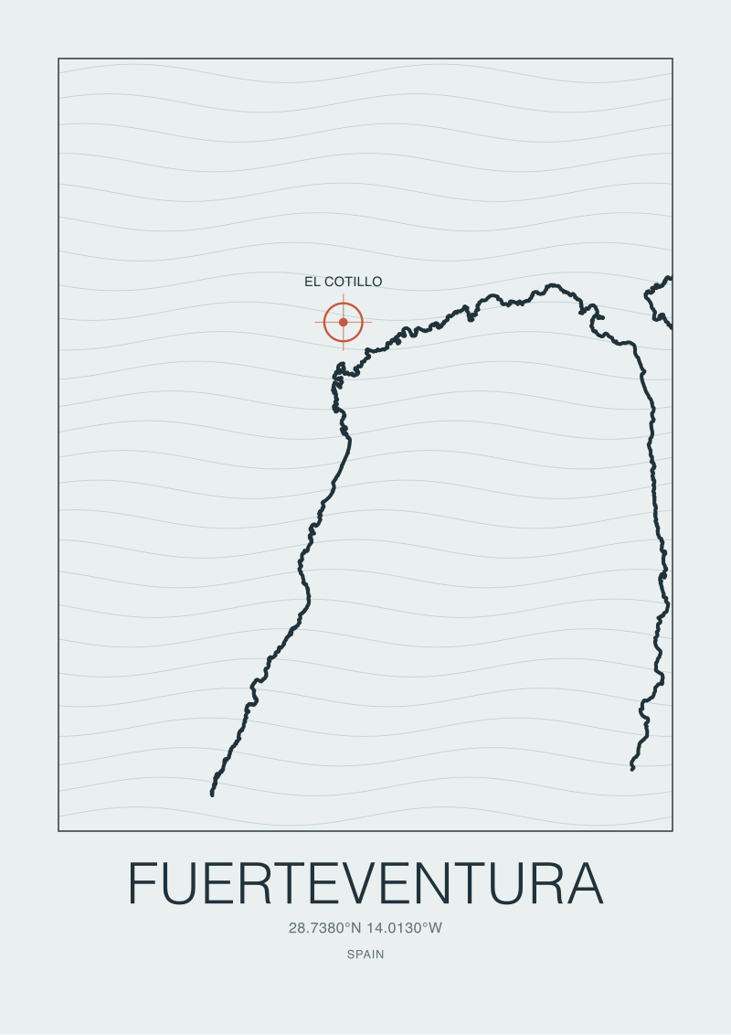
There is also a research cost worth naming. To draw El Cotillo honestly, someone at the studio pulled the WGS84 vertices from OpenStreetMap via Overpass, verified them against a second source (usually a national hydrographic office or Copernicus marine data), chose a projection that respected the Canaries' latitude, chose a generalisation tolerance that preserved the volcanic points and reef edges, and then committed to a legend that told the reader what all of that was. That is four to six hours of desk work per coast, before a single mark is made. A studio that charges eighty euros for a framed print is not doing that work. It cannot. The maths does not close. The map on the wall reflects the budget behind it, whether the buyer wants to see it or not.
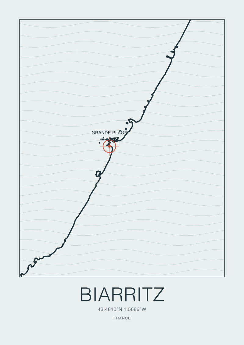 Biarritz
The print from this article · from €29.95
View the print →
Biarritz
The print from this article · from €29.95
View the print →
If You Only Remember One Thing
A coast print is a document, not a decoration. Before it goes on your wall, ask four questions: what dataset was the coastline drawn from, what projection was used, what scale is the sheet true at, and what generalisation was applied. If the studio cannot answer all four in a sentence each, the print is decorating a room, not remembering a place. That may be fine — plenty of walls want decoration. But do not confuse the two, because you will feel the difference in ten years, when the print is still there and the place is still there and one of them has quietly stopped matching the other.
The four dots on our desk this week — Biarritz, Ericeira, El Cotillo, La Gravière — are becoming four prints on four different sheets, each drawn at the scale that preserves the shape that made the wave. That is the whole editorial position of this studio in one sentence, and it is why we keep our shop at /shop/ small and slow rather than broad and fast.
FAQ
What coordinate system should a coastal wall print use?
The global standard for point data is WGS84, the same datum GPS and OpenStreetMap use. For the drawing itself, projection choice depends on latitude and how much coastline is shown: Lambert conformal conic works well for mid-latitude European coasts like Biarritz or Hossegor at around 43° N, while equal-area cylindrical projections handle the Canary Islands at 28° N with less vertical stretch. Ask the studio which projection they used and why — the answer tells you whether the shape is honest.
What does "coastline source" mean on a print's legend?
It names the dataset the shoreline was traced from. Reputable options include national hydrographic offices, Copernicus marine services, and OpenStreetMap's natural=coastline layer under the ODbL licence. Each source has a different vertex density and update cadence. A print that lists its source is committing to a checkable claim. A print with no source line is asking you to take the shape on trust, which is fine for stylised work but weak for anything sold as accurate.
Why does the coastline paradox matter when buying a print?
Because two prints of the same shore can both be accurate at different resolutions and look completely different on the wall. The paradox, formalised by Lewis Fry Richardson and popularised by Benoit Mandelbrot in 1967, means coastline length grows as your measuring ruler shortens. A print smoothed for readability at one metre per centimetre will show a different Ericeira than a print rendered at ten metres per centimetre. Neither is wrong. Knowing which one you are looking at is the point.
How can I tell if a coastal print has been over-generalised?
Compare the shape on the paper to the shape on any reference map at similar zoom — OpenStreetMap standard tiles or a national mapping agency's viewer both work. Look specifically for small headlands, river mouths, and reef edges. If the print has smoothed a distinctive point like Ribeira d'Ilhas at Ericeira into a plain curve, the generalisation algorithm was run at too aggressive a tolerance. The print is decorative rather than descriptive, which is a valid choice only if the studio names it as such.
Does scale actually matter on a wall print I will never navigate by?
Yes, because scale is what makes the shape legible. A print of a forty-kilometre coastline at studio scale can render the town-by-town structure of a shore. A print of a five-kilometre bay at the same paper size can render the individual rocks and inlets of a single break. Same paper, different arguments. A silent scale is a signal that the printmaker did not decide which argument the piece was making, which usually means the piece is not making one.
Is OpenStreetMap coastline data good enough for framed wall art?
For most European coasts, yes, provided the studio pulls it correctly via the Overpass API, respects the ODbL attribution licence, and reprojects for the latitude in question. OSM's vertex density is high in surveyed regions like the French southwest and the Portuguese Estremadura. Coverage is more variable on volcanic islands like Fuerteventura, where you may want a second source cross-check. The important thing is that the studio names the layer and version they used, not that they used OSM specifically.
What projection distortion should I watch for at different latitudes?
Web Mercator, the default in most online mapping, stretches shapes vertically as latitude increases. At 28° N (El Cotillo on Fuerteventura) the stretch is modest. At 43° N (Biarritz, Hossegor) it becomes visible to the trained eye. If a studio sells prints of coasts at very different latitudes rendered in the same projection without correction, the visual family is a fiction — each coast is subtly stretched by a different amount. Equal-area or conformal projections chosen per latitude fix this.
Should I frame a coast print with glass or without?
This is craft rather than cartography, but the short answer is museum-grade glass with UV protection if the print is pigment ink on cotton rag, which is the standard for archival coastal prints. Direct sunlight will fade even pigment inks over a decade. The map itself is a document; treat it like one. Studios worth commissioning from will tell you the paper weight, the ink type, and the light-fastness rating without being asked — that transparency is the same discipline that shows up in how they handle the coastline data.
New breaks and 10% off your first print.
One email now with your code. No noise after.